Fusion - Metro Email Newsletter Template Marketing


Fusion Newsletter Template is a set of Metro style email templates, It can be use for any product or any type of your campaign like E-commerce, Affiliate, Promotional, News and much more. It work well with any kind of email service provider (e.g. Aweber, iContact, Benchmark Email, MailChimp, Campaign Monitor, or Constant Contact), already tested on various browser and majors email clients (e.g. Outlook, Gmail, Yahoo, Hotmail and browser IE, Firefox, Opera, Safari, Chrome and more…)


Newsletter Template Features:
- Clean & Modern Design
- All Layer PSD Files Included
- 54 HTML Files
- 6 Premium Templates
- 9 Color Scheme
- Valid HTML Code
- Commented Code
- Well Documented
- Majors Client Mail Support
- MailChimp Ready
- People and product photos used for demo preview only and not included in the main file.
If you need any help, please feel free to contact me through my profile page. Thank you

Latest Update
20 March 2015
- Improved horizontal center elements on Yahoo.
12 March 2014
- Improved document file.
23 November 2013
- Fix HTML code for iPhone display.
6 August 2013
- Already fix inline-CSS to support Gmail render.
13 June 2013
- Already updated to responsive version.
9 April 2013
- fix HTML code for outlook display
20 March 2013
- Update Document (included how to import Mailchimp)
3 March 2013
- Update for MailChimp Template Editor
- Update css fonts
Did you like this template? You may also like this
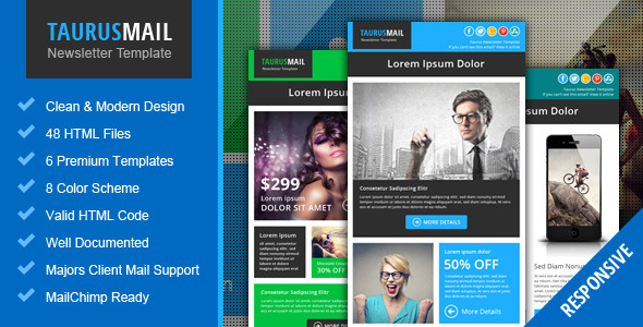
Taurus – Metro Responsive Newsletter Template
Piscesmail – Email Newsletter Template

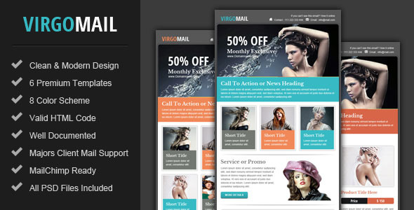
Virgomail – Email Marketing & Newsletter Template
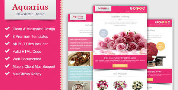
Valentine Email Marketing & Newsletter Template
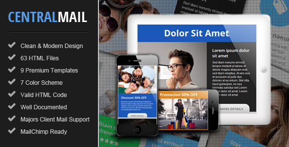
Central – Responsive Email Newsletter Template


Hi, i replace main-image (theme 1 responsive) with another image with the same size of main-image. But when i see the preview on mobile phone, the resize of the new image doesn’t work. What’s the problem?
ReplyDeleteI upload the template with the first metod (html file) in your guide
ReplyDeleteHello
ReplyDeleteBecause the Mailchimp template editor cut off in-line stylesheet that define auto width and height from the template.
When you already replaced the image in template editor you can go to “Edit Code” section and find <img> tag of main image at the code line number 403, you can add “width:100% !important; height:auto !important;” to in-line stylesheet as below.
<img src="PATH OF IMAGE" alt="main image" border="0" style="width: 100% !important; height: auto !important; margin: 0; padding: 0;" mc:edit="mainimage">
The image will auto resize when preview on mobile devices.
Regards
Pophonic
what are the differences with the taurus template ?
ReplyDeleteHello
ReplyDeleteThese templates have different arrangement layout and some of unique elements e.g. promotions section in Taurus template 4.
Regards
Pophonic